Designing a high-end brand and user experience
About the client
S+C Partners LLP provides first-class, professional accounting services including assurance, tax, advisory and information technology to support financial commitments, minimize tax liabilities, optimize profitability and automate business processes.
Services provided
- Discovery
- Website & Digital Marketing Audit
- User Experience (UX) Strategy
- Brand Direction
- Website Design
- Web Accessibility Compliance
The challenge
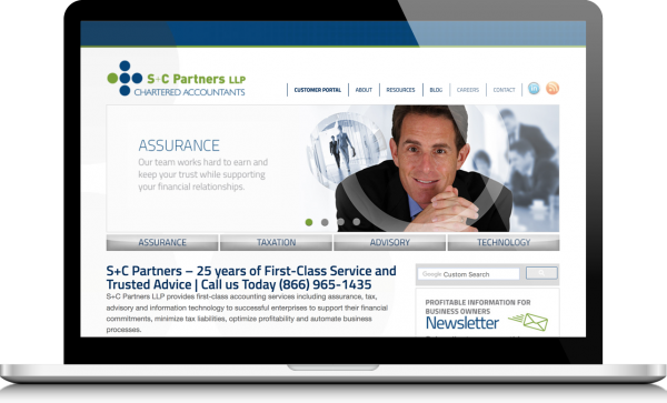
S+C Partners first approached us with the task of redesigning their website which was out-dated, packed with excessive content and lacked mobile responsiveness and consideration for accessibility requirements. What started out as a website refresh, ultimately uncovered bigger issues that couldn’t be accurately addressed without a cohesive brand strategy and vision. The client agreed to re-examine their brand and identify opportunities for improvement and growth.
Original Website
The research
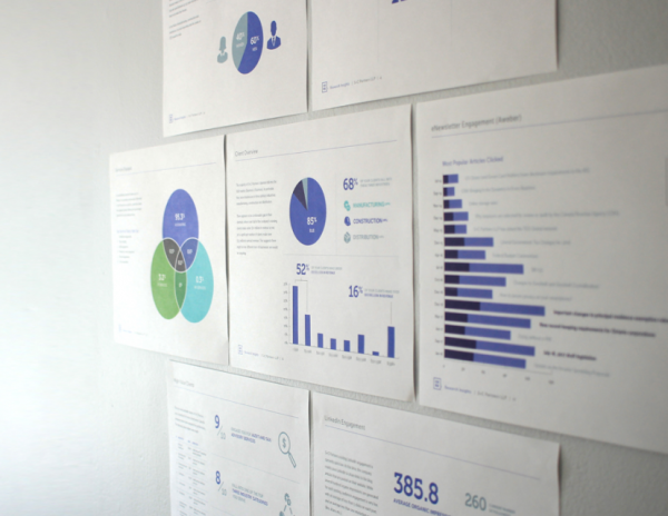
To begin work, we gathered preliminary research on their existing clientele to identify who they were targeting, what services and industries they specialized in and how we could go about targeting their intended clientele.
An insights document was compiled with our findings, which summarized their company’s current standing and outlines their long term goals and ambitions. It was evident that their level of service, attention to detail and dedication to quality were clear differentiators from their competitors.


The discovery workshops
Discovery workshops were conducted with the executive team in order to identify their key target audience and create user personas to help empathize and understand their client’s point of view when interacting with their company.
Together, we walked through user journeys to identify how clients might feel, what questions they might think about, what their priorities might be and what the current interactions are with the various touch points of the company. By doing this, we not only developed a clear understanding of who we’re targeting but we were also able to identify various opportunities for improvement and gather insights as to what kind of messaging and brand vision would appeal to the target clientele.


The new brand direction
Through our findings, it was clear that the level and quality of service that S+C Partners provide their clients was best suited for high net-worth clients and they needed a brand image that reflected the dedication to quality service and expert advice.
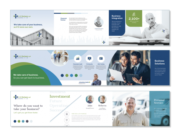
Using the brand attributes that were uncovered in the discovery workshops along with the insights about their target clientele and company positioning, we created three moodboards that encompassed three different approaches to their visual brand system.


The application
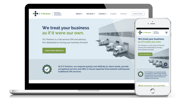
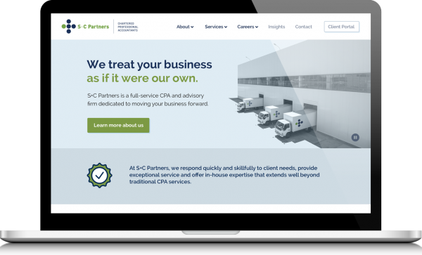
The client decided to proceed with the idea that focused on taking care of their clients’ business just as much as if it were their own. This concept utilized large scale imagery and industrial architecture to tie into their primary clientele’s manufacturing, construction and distribution industries. This concept became the master art direction guide for fleshing out the full website design.
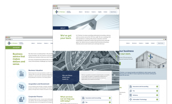
The brand system introduced a cooler, muted secondary colour palette to establish a sophisticated look, coupled with accents of their existing corporate blue and green colours to bring warmth and focus to key information and messaging.






The results
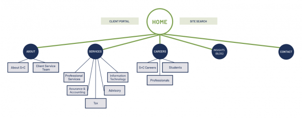
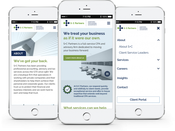
We created a modern website which combined large-scale industrial architecture imagery with their extended colour palette to align with their new brand direction. The website was also responsive to mobile devices and in compliance with AODA accessibility requirements.
S+C Partners fully embraced their new brand system and has extended their branding to other marketing materials and communications. Overall, the website was well received by their customers and S+C Partners was very satisfied with the final deliverables, providing them with a cohesive and consistent brand and online presence.


Words from the client
“Working with Evelyn and her team has been a great experience. We valued their strategy workshops which provided insight and clarity regarding our core audience and messaging. They developed unique website designs and branding materials we’re excited to implement and provided timely feed-back throughout our project.”
Michael Rayner
Client Service Partner, S+C Partners LLP


