Mitchell Sandham Website
About the client
Mitchell Sandham is one of the oldest and largest independently owned insurance brokerages in Ontario. They are a highly specialized, privately held insurance brokerage with a deep understanding of insuring Canadian companies and protecting the personal assets of the owners, partners and executives who run them. They specialize is providing customized insurance solutions to various niche industries.
ClientMitchell Sandham Insurance BrokersServicesWeb Design, UX & Content Strategy, Brand Strategy, Print DesignYear2017
The problem
When Mitchell Sandham approached us for a website redesign, they didn’t quite know what they needed. They had undergone a rebrand with a freelance designer, which resulted in a new logo, brand colours and typography.
They wanted to implement their new brand into their website, but they didn’t quite know how to go about the process. The client knew their website looked out of date and needed to be responsive for mobile devices, but they struggled with communicating what made their business stand apart from their competitors.
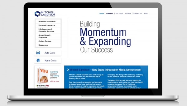
Old Website
The approach
After conducting several interviews and client discovery sessions, we identified their core business as delivering insurance solutions and impeccable customer service to businesses and the people that run them. They focus on providing full service insurance solutions to business owners and high net worth clients.
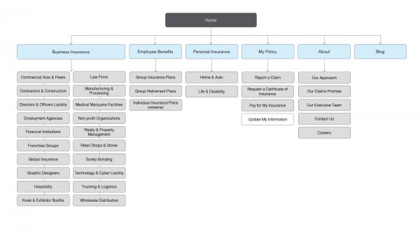
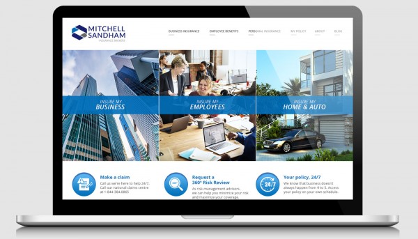
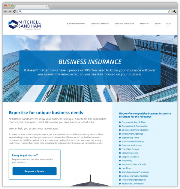
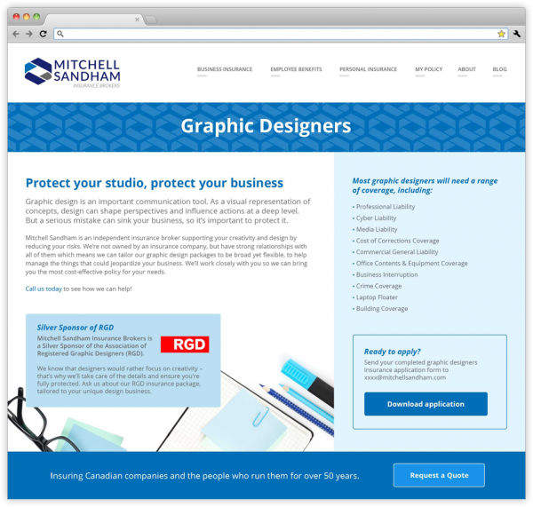
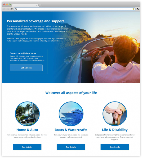
We assessed their existing content, and proposed a new site architecture and content strategy. The homepage focused on highlighting three types of insurance business owners would be interested in: (1) business insurance, (2) employee benefits and (3) personal coverage. To showcase their expert knowledge of various niche industries, we created dedicated industry specific pages, to show their clients that they were familiar with the challenges and needs of their business.
The solution
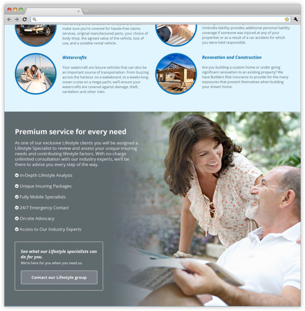
Their existing website was lacking the high end polish that their high net worth customers are looking for. Working together with copy writer, Heather Finley, we developed a new tone and content for the website that spoke to the needs of their customers. For the visual design, we used their new brand colours as bold accents throughout the site to fully embrace their new brand and to also divide up the content into easily digestible sections. We coupled this with large lifestyle imagery that would resonate well with their target clients.
A fresh new look
The new website is bright, modern and targeted at their ideal customer. Who they are as a company and the products and services they offer is much more clearly defined. Their brand colours and style is now consistent throughout the website. Cross-linking further leads the user to other relevant content and information for a smooth browsing experience.
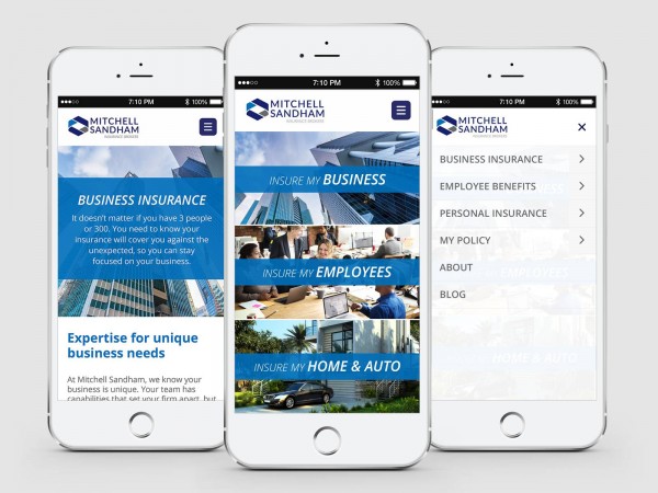
Maximum accessibility on mobile
The new website is fully responsive, with intuitive navigation and simplified page designs. The content is easily digestible on mobile devices, while retaining the lifestyle imagery to keep the brand vision intact.
