Zenials Branding
Zenials is a technology company startup whose mission is financial inclusion by providing access to basic financial services through a new online platform.
We were approached to create a branding identity for this new venture. With the name already established, the challenge was to create a versatile logo and colour palette that would be applied to the company’s future marketing and promotional materials.
ClientZenials ServicesBranding, Stationary DesignYear2014
The new branding
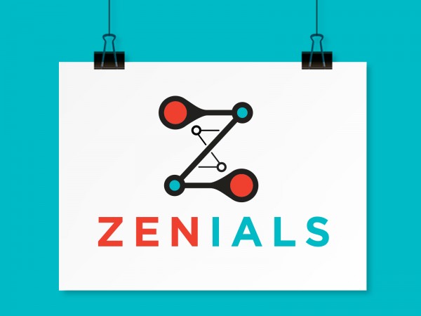
The new branding focused on the idea of creating a community of financial services and users, ultimately resulting in a letter “Z” symbol in the form of a simplified network of dots. Straying away from typical colours like green and navy (often used in the financial sector), bold modern colours were used instead to both compliment and contrast each other, creating a memorable colour palette. The new contemporary logo suggests innovation and unity overall.
Business cards
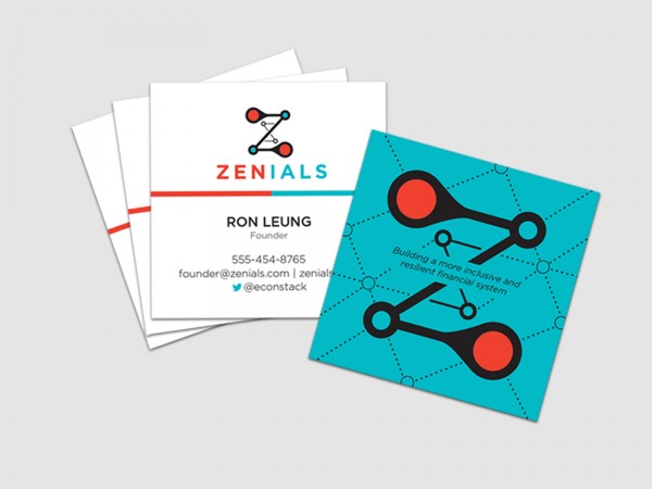
In order to further differentiate the company from similar competitors in the financial industry, a unique square business card design was created with bold colours and graphics. The design focuses on the idea of a network, which ties into the idea of developing a new community of financially savvy users.


